


A website’s homepage is the front door and arguably the most important page on your website. It is usually the first page that users and potential customers see. And guess what? First impressions really do matter. If your audience’s experience isn’t good from the start, you might as well wave them goodbye.
Your homepage needs to serve a lot of purposes. It needs to:
- Speak to all of your audience members
- Set the tone and image of your brand
- Show users and customers why they should trust and choose your business
- & more
Now, knowing the importance of a properly designed and optimized homepage, let’s take a look at the homepage essentials.
8 Essential Homepage Elements
The main goal of your homepage should be to grab attention and create a want or need to dig deeper into your website or brand. Strike a balance between a refreshing creative appeal and just enough information to hook your audience. So, take advantage of these essential elements on your quest to design the perfect homepage and website layout.
#1
Eye-Catching Headline
As soon as a user loads your homepage, they should get an idea of what your business has to offer. It should be clear, concise, and resonate with a majority of your audience. From a few words to a short sentence, you should aim for a powerful message.
Pro tip: Set your Brand’s tone. If you do it right, this alone will add a layer of uniqueness.

#2
Navigation
Websites should funnel users into different paths and proper navigation is crucial in doing this. Not only that, but easy navigation can keep users onsite. If a potential customer is unable to get information or find a product they are looking for, then frustration sets in, and they leave.
Your homepage NEEDS a main navigation area that highlights the most important services, product themes, or actions you want customers to take. Try and keep it as simple as you can. A main navigation with ten options can seem very overwhelming. So, create a hierarchy if needed and add sub-navigation that expands on hover. Furthermore, you can include a search bar to make it even easier for users to find information.
#3
Call-to-Actions
We already noted that your homepage should make users want to dig deeper. Make this easy for them to do by including call-to-actions throughout the homepage. Space them out, keep them engaging.
Before the designing process even begins, you should have already discussed the specific goals you want your website to accomplish. CTAs should meet those goals. Additionally, they should stand out! Use contrasting colors, ALL CAPS, or bold fonts. Most importantly, keep them simple and short. Get creative, you want to turn heads!
Call-to-Actions can include:
- Newsletter Sign-Ups
- Schedule a Consultation
- Sign-ups or Profile Creations
- Content Offer (Free Download, Infographic, Guide, etc.)
- Start Shopping
- & More
Pro tip: Have at least one CTA above the fold.

#4
Compelling Website Copy
Many businesses use websites as a way to load users and potential customers up with information. While having necessary information is important, less is more. Modern websites must strike a balance between copy and media content. People do not like reading paragraphs on paragraphs when they reach landing pages. That is what blogs are for.
You want to show the most important features of your brand. Most importantly, you want to keep your content engaging and interesting. Follow your brand identity by adding personality and tone into your copy when you can as well!
#5
Be on Brand
A homepage sets the tone of your brand. Users should know exactly who you are and what your business represents right off the bat. Moreover, your homepage will set up and guide the design and layout of the rest of the website. Therefore, you should aim for consistency and harmony, so users do not leave feeling confused.
Ways to highlight your brand:
- Clear and prominent logo (but not too overwhelming)
- Color palette
- Tone and personality throughout text and content
- Tagline that is on brand
- Creative content
#6
Clean Design
Users do not want clutter, end of story. A clean design is essential. Gone are the days of loading up a homepage with all of your website’s information. Utilize the navigation and CTAs to lead customers into more detailed funnels. Here are some tips for keeping your design nice and clean:
- Whitespace, or negative space. Use it. It will help balance and organize the visual content.
- Balance copy with media (images, videos, infographics), and make sure they are good quality. Grainy images that are blown up and pixelated do not create a positive experience.
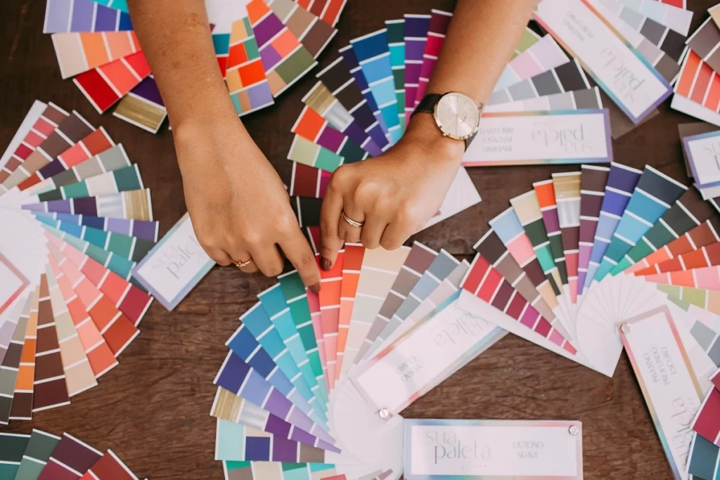
- Choose a color palette that blends and works well together.
- Properly use headings and subheadings to organize content.
- Don’t overdo the content. We know we already touched on this, but it is important.
#7
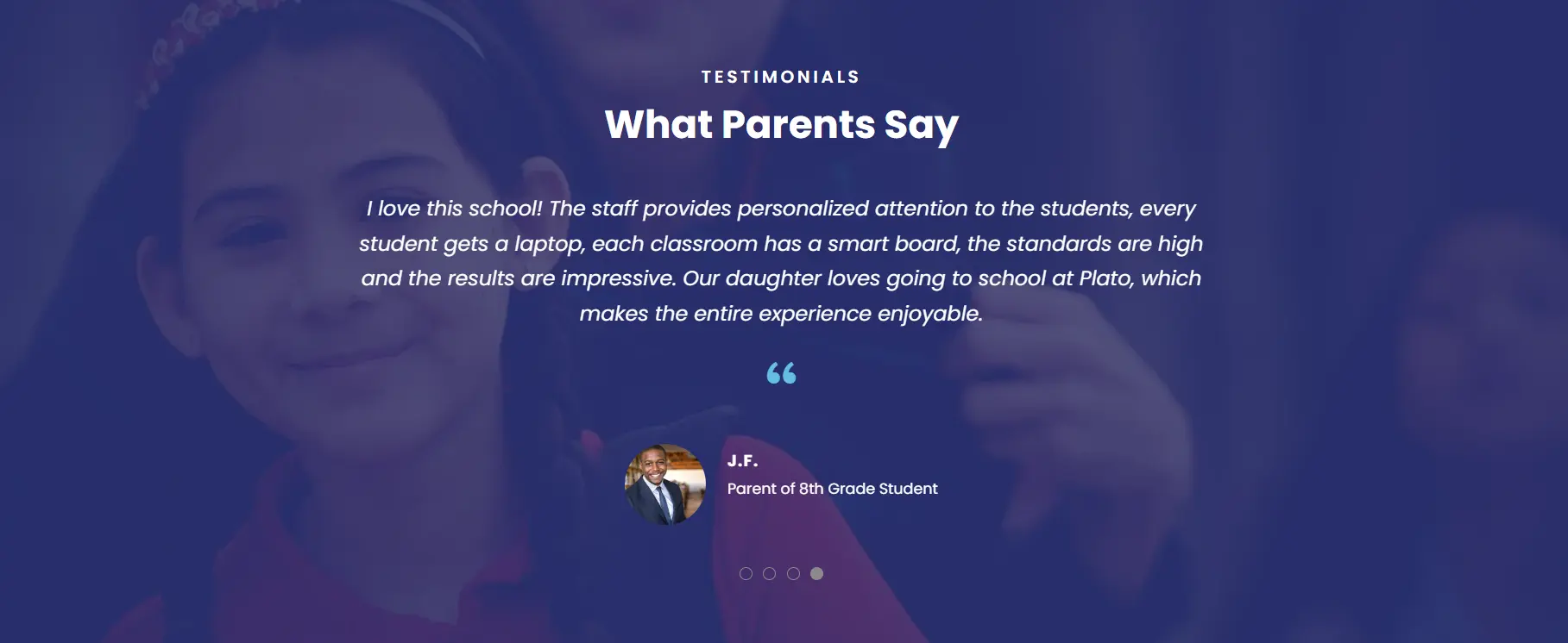
Social Connection
Today’s users are heavily influenced by what others are doing, and often take into consideration how others perceive a brand. So, highlight why others love your brand! You can do this with testimonials, reviews, and case studies.
Lastly, most businesses should have some type of social media, if you don’t, why not? Connecting your social media to your homepage could offer a great way for potential customers to follow your brand. Someone coming to your website for the first time might not be ready to buy, but if they connect with your brand on social media, you then have more opportunities to convert them.

#8
Footer
Footers can be a great way to list additional resources, important information links (privacy policy or disclaimers), and be a creative way to add CTAs. The best part? It’s not just visible on the homepage. Moreover, they can be a great way to organize information that may be spread out through your website, which gives users an easy way to navigate and see content they may have missed.
When created properly, footers can also indicate to users that they have reached the end of your homepage.
Layout a Website Homepage for Success
As a designer builds out a homepage, there are certain hierarchal needs that are taken into consideration. Most importantly, this hierarchy is built with users and customers in mind.
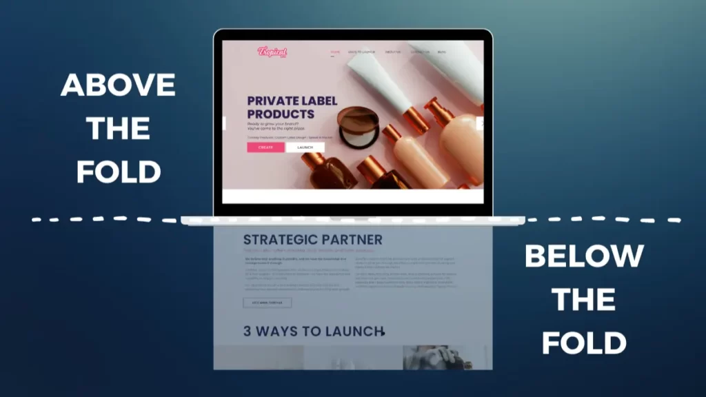
First, you need to understand what information goes above the fold, and what goes below. On whatever device a user is viewing your website on, the above the fold section is the area that is immediately viewable without scrolling. The below the fold is everything viewable once a user scrolls. Every above the fold section should answer three important questions:
- Who is your brand/business?
- What does your brand/business do?
- What unique thing can you offer or how can you serve your customer?
Everything else can go below the fold! Great, but exactly what information should you include?

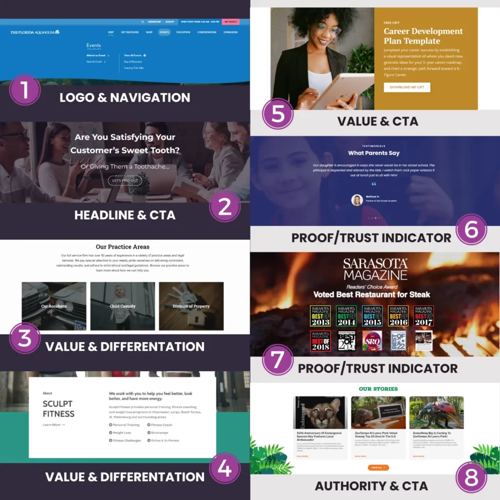
Information Found on A Homepage
Let’s first note that even the information below the fold should follow a logical order. Lay information out with the idea that a user may not scroll all the way to the bottom. This means putting the most important information at the top and then adding additional information that builds trust and authority.
The information throughout the homepage will want to hit all of these categories in some way.
- Value: Services, programs, or what you offer your customers.
- Differentiation: Benefits or uniqueness of your products or services.
- Authority: Clients you have worked with, examples of work, or even a small blog gallery.
- Proof/Trust Indicators: Testimonials, reviews, and case studies are just a few examples.
- CTAs: These should lead users/customers into funnels and aim towards meeting set goals.
Don’t forget to include images and other forms of media! This will help draw eyes, engage users, and break up text and information.
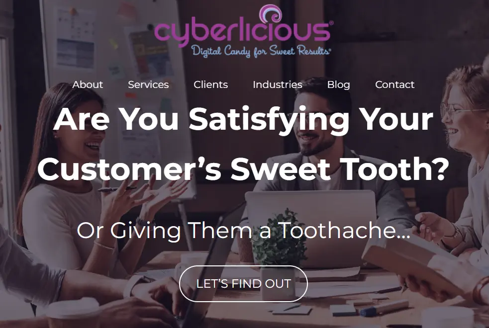
Website Homepage Layout Example

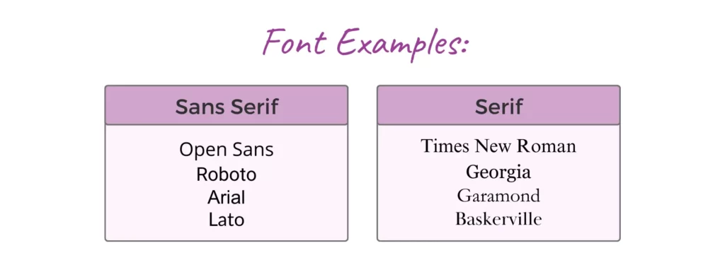
What is the Best Font for Website Design?
There is no single “best” font to use when designing a website. Oftentimes, it will depend on your brand, the tone you want to set, the type of content, and even your audience. Most websites use either Sans Serif or Serif fonts for the main content. Headlines, and other similar text, can use a different font to add some design and visual appeal.

A great way to gauge whether or not the font you are using will work well is to follow some basic rules:
- Readability: Make sure the spacing isn’t too tight, and the font size isn’t too small. On the other hand, you don’t want it large enough that it creates unbalance in your design.
- Audience: Does it match your audience? Certain industries may benefit from a more formal font, while others can get away with a more playful one.
- Emphasis: Headlines can be emphasized with a different font altogether if wanted. Otherwise, bolding the font can also be done.
- Consistency: Will it work for your entire website? Choose a font and stick with it.
- Brand: Strike a balance between setting the tone of your brand, and one that resonates with your audience.
Overall, the most important rule is that your fonts must be easy to read. This includes the font’s color. If users cannot easily read your font they aren’t going to stick around and try to decipher it.
Experts Who Know the Ropes
Listen, at the end of the day, designing a website is time consuming and can be very frustrating. This is especially true for those with little to no experience in website design. The homepage is just one page of the website. To make everything run seamlessly you also need to consider:
- UI/UX Design
- Mobile Responsiveness
- Testing of All Features & Elements
- & Much More
This is where the experts come in though. The Cyberlicious® team has combined website design and development experience, content creation, and even SEO knowledge that allows us to deliver websites with a delicious user experience. Whether you need a website created or redesigned, we got you covered. If you really want to try your hand at it though, go for it! You know where to find us.